

Cournot's original graphs from 1838. While a significant step forward in making Economics more accessible, the graphs are difficult to interpret and were consigned to a single textless fold-out at the end of a 200-page book.
Graphs in Economics – A Short History
Being able to understand, draw and manipulate graphs are core skills taught in Economics. The use of graphs to illustrate difficult concepts and aid analysis is almost as old as the discipline itself. François Quesnay famously illustrated the physiocratic model of the economy in his Tableau économique already in 1758.1
However, the first “modern” use of graphs in economic theory probably dates back to Antoine Augustin Cournot who used them to illustrate supply and demand in 1838.2 Today, graphs are an integral part of Economics, and their use is especially widespread in teaching undergraduate Economics.
Making Graphs Interactive
While graphs are used to help students understand abstract concepts and to provide intuition, some students struggle with graphing. Modern technology makes it possible for traditional static graphs to finally become interactive and easier to understand after almost 200 years.
We have covered some of the benefits of using interactive graphs in a previous blog post.3 If executed correctly, interactive graphs have the potential to enhance engagement and learning in Economics.
Using Interactive Graphs in Economics
The use of interactive graphs in teaching Economics can broadly be said to have 3 aims:
1) Explain concepts and graphs
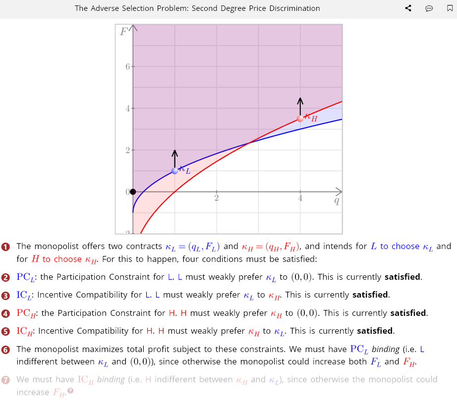
Interactive graphs make it easier to understand how a graph with many components is built up step by step – similarly to a lecture with whiteboard. Here this is illustrated with an interactive graph from Summatic that walks students through the challenging problem of adverse selection in second degree price discrimination.
2) Visualize changes in graphs
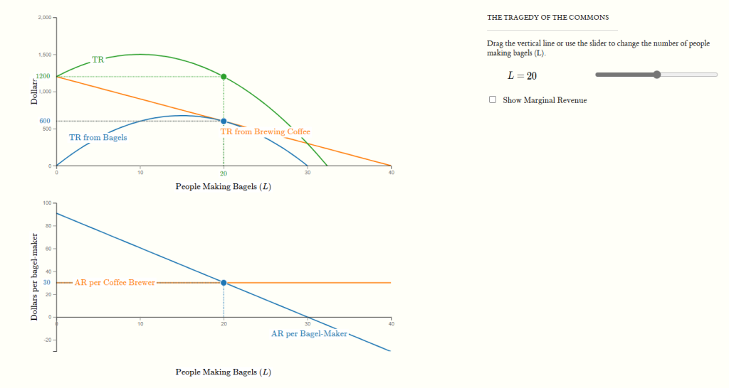
The ability to easily change parameters and move curves also make interactive graphs ideal for studying changes to the economy by visualizing them and allowing students to explore things on their own. Unlike when working with pen and paper there is no need to draw a new graph from scratch every time something is changing, or a mistake is made. Here this is illustrated by an example from Econgraphs that lets students graphically explore the tragedy of the commons by using a slider to change the number of “players”.
3) Assess student understanding
Interactive graphs can also be used for assessment, testing students' ability to draw and manipulate graphs. Unlike traditional graphing exercises, interactive exercises can be automatically marked, saving time for teachers and providing students with instant feedback.
Resources with Interactive Graphing
Online resources with interactive graphs explaining Economic concepts have been available for about 25 years.4 Today leading publishers typically provide gated access to interactive online graphs to be used alongside their textbooks. There are also many sites offering free graphing resources for learning Economics.
Most of these resources focus on introductory courses. For more advanced courses, Econgraphs5 and Summatic provide easy to use interactive graphs for Intermediate Microeconomics. Both use draggable points, sliders etc. to control graphs, paired with adaptive text. Summatic also have step by step explanations and a bank of questions with both graphical and quantitative components that can be used for assessment and independent practice.
What Students Think
At Summatic our experience is that students appreciate interactive graphs and find them helpful for understanding abstract concepts and for practice.
The diagrams in Summatic are super helpful, really useful for visualizing and understanding the models. – Student, University of Cambridge
This impression based on student feedback is supported by a recent study that used Econgraphs for lectures and quizzes in Intermediate Microeconomics.6 An overwhelming majority of the students at the studied UK and US universities found that interactive graphs were either somewhat or very helpful.
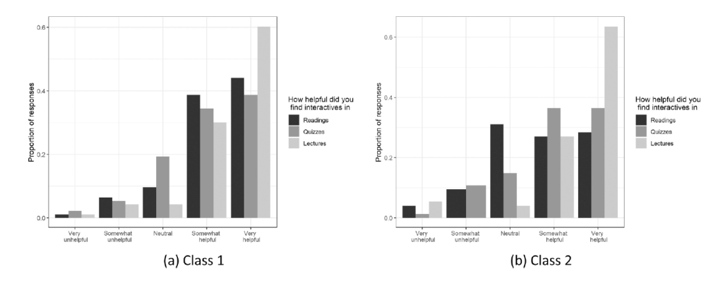
At the institutions that used interactive graphs in different settings, students found them more useful in lectures than in other teaching modes. Suggesting that interactive graphs are particularly useful in lectures, and that they sometimes need to be accompanied by additional explanations. The study also found evidence indicating that students were more likely to find exercises with interactive graphs very helpful than traditional pen and paper exercises.
-
Le Tableau économique de François Quesnay (FranceArchives).↩
-
Demir, I. & Tollison, R.D. (2015). ‘Graphs in Economics’. Economics Bulletin, 35(3), 1834-1847.↩
-
Halliday, S.D. et al. (2024). ‘Improving student comprehension through interactive model visualization’. International Review of Economics Education, 47, 100296. https://doi.org/10.1016/j.iree.2024.100296.↩
-
Halliday, S.D. et al. (2024). ‘Improving student comprehension through interactive model visualization’. International Review of Economics Education, 47, 100296. https://doi.org/10.1016/j.iree.2024.100296.↩